
Brighthouse Financial PRO Rates Experience
Aligning the functionality and table information to both user and business needs and priorities.
MY ROLE
UX Design Lead
PROJECT NAME
Rates Table Update
COMPANY
Brighthouse Financial

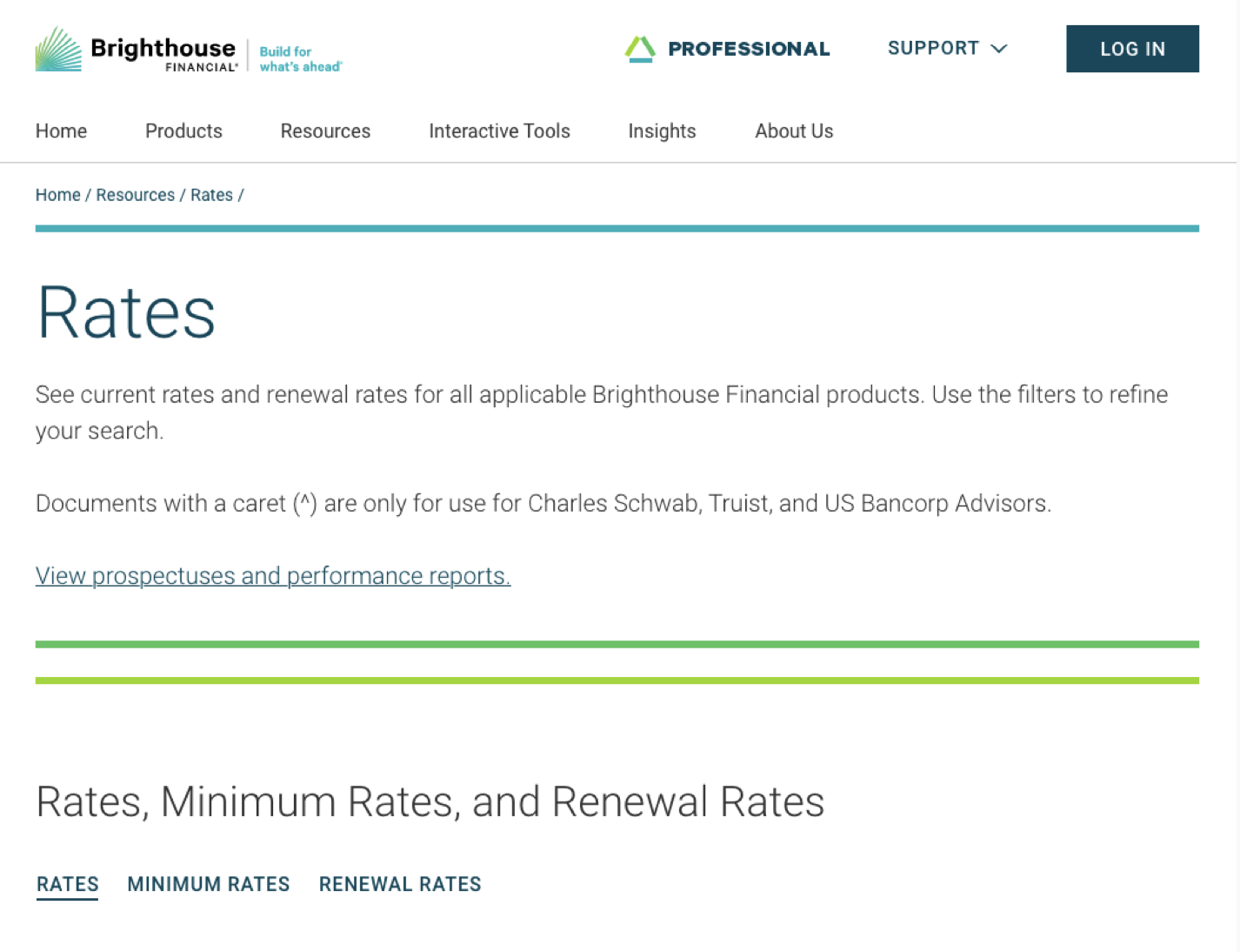
Pictured: A quick glance at the Brighthouse Financial PRO Rates experience
Project Overview
Financial professionals need a variety of documents from Brighthouse Financial in order to effectively do their jobs and provide their clients with timely, up to date information. Among those documents are sheets that provide rates, minimum rates, and renewal rates of the various products that Brighthouse sells. The previous iteration of the rates table provided all of the documents but the order of the filters, the columns shown, and the order of the documents within the table was shown in an order that didn’t reflect the needs of the user or the priorities of the business.
Problem
Prior to the redesign, stakeholders at Brighthouse Financial received feedback from users struggling to locate documents and finding some table information unhelpful. Additionally, index-linked annuity products, Brighthouse's most popular category, were buried one or more clicks deep in the table. These issues were further compounded by firm and state variations that required lengthy document labels.
Design Process
This project began with a kickoff meeting with a lead developer to understand the table's functionality. To effectively redesign it, I needed to learn how documents appeared in the table, why they were ordered in a specific way, and how the items in the filter were prioritized. I also needed to determine whether certain filters or columns could be hidden while retaining their data within the table. I discovered that the documents, filters, and their order were controlled by a .csv file uploaded to the component by a developer. This meant that the "design" work would take place in an Excel sheet rather than my usual workflow in Adobe XD.
After gaining a thorough understanding of the table's functionality, I met with the Brighthouse UX and web team to define our project goals and establish the desired document order. We decided to add a third toggle to the table for minimum rate sheets, reorder the product categories to align with user needs and business priorities, and organize the renewal rate sheets by year, from newest to oldest.
Once the functionality and goals were established, I reordered all the documents within the Excel sheet. This involved moving 39 documents into the new minimum rates toggle, organizing the documents first by product category and then by product variation, and reordering the renewal rates documents and filter years to display the most recent first. Collaborating with a developer, we removed the existing product category column while retaining the filter, allowing users to utilize the filter without the column taking up valuable space in the table. This adjustment made it possible for longer document titles to fit on a single line.

From left to right: Rates Product Category drop down, Renewal Rates year drop down, Minimum Rates toggle
Solution and Results
Through communication and collaboration I was able to deliver an experience that solved the challenges that users were facing. I delivered on promises to feature priority products and rate sheets, create a filtering experience more aligned with user needs, and de-clutter the table interface by removing columns and creating a third section for minimum rates.
While it is too early to pull any quantitative data on this recently launched (12/02/2024) update, the qualitative data suggests that both the business and the user find value in these changes. A group of financial professionals I spoken to throughout the project let me know that they found it much easier to find the correct rates sheets without extensive searching.
Lessons Learned
Not all design work needs to be done with a design program to have a tangible impact on user experience. This project did not require me to open Adobe XD and yet there were real UX upgrades made as a result of simply re-ordering some items within an excel sheet. The other major takeaway I had from this project was that a complete understanding of component and developer capabilities continues to be a major advantage when it comes to providing the best user experience that I can. Although it contains hundreds of documents and variety of labels, filters, and search tools, the table is a pretty basic component at its core and its functionality is driven by an excel sheet rather than code. Having that knowledge led to a more efficient process throughout the project.