Reimagining Delta’s Flying Experience
Overview:

My Process:

Research Plan:
Primary Research
Competitive Analysis
Surveys and Interviews
Research Goals and Overview:
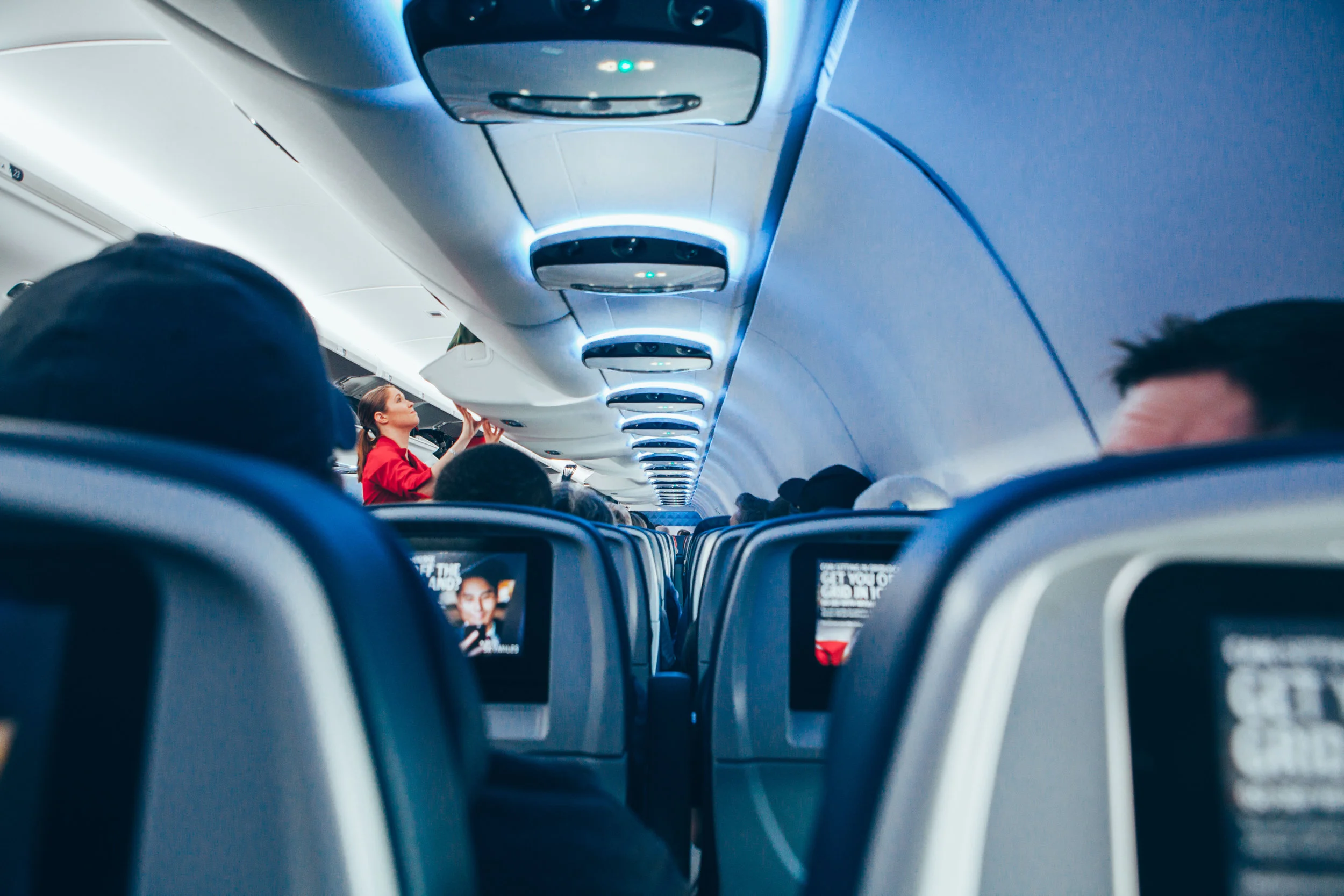
We needed to figure out people’s attitudes about the entire process of flying from purchasing a ticket, to getting home from the airport after their trip. This includes users’ experience with mobile apps, in-flight services, in-flight technology, what they do while flying, and more. We needed to understand where the pain points were and focus on those areas.
Primary Research Findings:
Delta is currently focused on domestic flights, but expanding their global hubs, adding locations in London, Paris, and Amsterdam
“Plan your next adventure”: Delta’s model focuses on the business traveler, but it is starting to focus on millennial travel because the latter is expected to increase significantly by 2020
“Rewarding your loyalty”: Emphasizing another one of Delta’s mottos, the company has the SkyMiles ® frequent flyer program to increase traveler loyalty through miles and points
Delta’s partnerships include Lyft and Airbnb, which allows you to earn more SkyMiles ® points
Competitive Analysis:
Delta’s biggest competitors are United, Southwest, JetBlue, and American
Most airlines only compete over low fares
Delta justifies higher prices by offering excellent customer service
Mobile apps offer similar features and usability
Survey Findings:
The team conducted a screener survey and received 67 responses. 65% of responses were from people 27-35 years old. We discovered that nearly 93% of survey respondents use their phones during flight while one-third of respondents use laptops and tablets. In addition, nearly 36% of people surveyed preferred Delta, the most of any airline mentioned by respondents.

Interview Insights:

Synthesizing the Research:

People are less concerned with the in-flight experience than they are with the surrounding experiences
People loathe surprises at any point in their journey but especially before their flight
People typically bring their own entertainment for the flight
People feel like they need the necessary information for boarding, deplaning, and connecting flights
Based on our research, we identified two main groups to focus on. The business traveler and the adventurer. Although they travel for different reasons, each measures success through communication, customer service, and efficiency. Both of our user groups identified pain points related to boarding and de-planing, sharing their flight information with contacts, tracking bags and connecting flight information, and unexpected delays.
Defining What We Have:
The team created an axis map to help prioritize some of the pain points we had identified through our research. We felt it was important to be able to visualize what we can and cannot design for based on whether the pain point is related to something digital or operational.

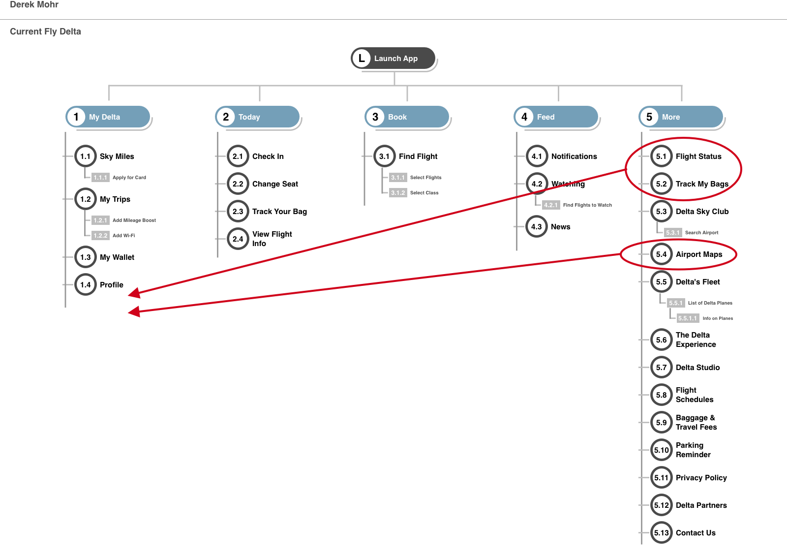
Through feature prioritization, we identified several pain points that we felt could be designed for. Some of those pain points included not being able to easily track flights and issues related to connecting flights. I roughed out a sitemap of the current Fly Delta app in order to see how their information architecture could be restructured in order for users to be able to more easily access features that might potentially mitigate those pain points.
Developing the Solution:

When sketching our wireframes, we needed to keep in mind that having a simple information architecture was going to be crucial. We also recognized that we needed a comprehensive itinerary that prioritized usability.
We wanted passengers to be able to plan and keep track of their next steps while not having to rely on flight attendants or other people to provide updates on their journey. They needed a guide to help mitigate some of the stress that people experience while flying.
Initial User Testing:
We conducted five usability tests and received the following feedback:
Font is hard to read
Secondary navigation is confusing
Refined Solution and Prototype:
In addition to assisting in the wireframes of the My Trip page, I was in charge of the Share Contacts feature from the sketching stage to the prototype.
The Share Contacts function of the new My Trip feature
Our solution focused on the reorganization of the information architecture of the app. We created the Sky-Tinerary tab which allows easy access to the users in-flight services, their My Trip itinerary, airport maps, baggage, and their boarding pass. With that organization came the design of new features such as sharing with contacts and messaging your flight attendant. We used InVision to prototype.
Conclusion:
Ultimately, the journey of flying is always going to be stressful for users. Our solution helps to mitigate some of the pain points identified by users. By evaluating and reorganizing the information architecture, we were able to make the Fly Delta app comprehensive and easy to use.
What I Learned:
The most important thing that I learned was that the scope of my design matters. We designed a product that mitigated many of the pain points identified by users but could have gone deeper on a few of them rather than scratching the surface of many. I learned to hone in on one area and ask deeper, more insightful questions during research in order to avoid surface level design solutions.