
Brighthouse Financial PRO
A website redesign for a company that sells annuity and life insurance products.

MY ROLE
UX/UI Design Lead
PROJECT NAME
Advisor 2.0
COMPANY
Brighthouse Financial

Pictured: A quick glance at the Brighthouse Financial PRO home page and Shield Annuity product page
Project Overview
As Brighthouse Financial shifted their business goals from brand recognition to becoming an industry leader, they recognized a need to distinguish the consumer facing website from the financial professional facing website. The existing pro website had similar branding and language to the consumer site and required a total rebrand of the pro site in order to provide financial professionals with a more effective customer journey.
Problem
Prior to the redesign, Brighthouse Financial faced a number of challenges that were hindering their ability to attract and retain financial advisors willing to sell their products. The previous version of the professional site made it difficult to distill key product information, find interactive product tools, access contact information, and navigate the site quickly and easily. An evaluation of the sitemap also revealed that both the help center and insights sections were cluttered and confusing for users.
Design Process
This project began with a comprehensive kickoff to understand the needs of different areas of the business, including product and channel marketing, IT, and sales. This was followed by an extensive audit of the website, completed by me and other members of the Brighthouse UX team. Using our audit findings, previously gathered user research, and Brighthouse’s component library, I began to create low-fidelity wireframes for the different areas of the site and solicit feedback from stakeholders.
After gathering feedback and refining the wireframes, I began developing high-fidelity screens that incorporated images and brand colors. Working closely with developers, I created interactive prototypes in a staging environment, which allowed for further user testing of new interactions.
Once all new experiences were approved by the appropriate stakeholders, I handed them off to the development team for building. As the design lead, I stayed closely involved with the developers during all stages of the build. I also played a significant role in the QA process, ensuring the final product met all design and functionality requirements.
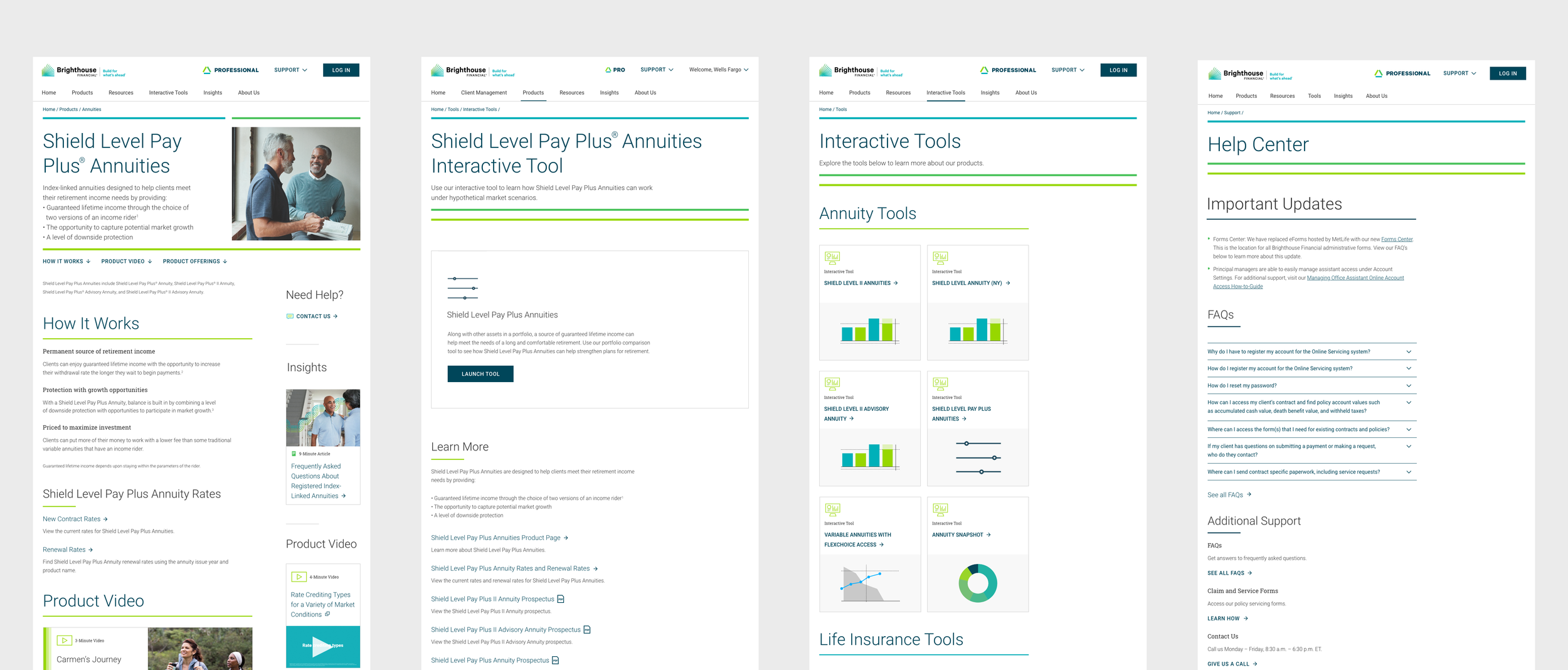
From left to right: Shield Level Pay Plus product page, Shield Level Pay Plus tool page, Interactive Tools page, and Help Center page
Solution and Results
Through research, planning, and design I was able to deliver an experience that solved the challenges that users were facing. I delivered on promises to feature concise information financial professionals were looking for, create a new tools experience within primary navigation and product pages, and allow for a more intuitive way for users to find help for contract and business needs.
The end product not only looked great but also drove immediate results. Product pages now provide quick, concise information and a sticky nav that allows them to get to the section they need immediately, decreasing the amount of endless scrolling from users. The Help Center cleanup led to a 12% decrease in call center volume within the first two months of launch, a key indicator that users were finding what they needed within the new experience. Most importantly, tool usage increased by 15% and tool drop off rate decreased by 60% within the first two months of launch.
Lessons Learned
Leading the re-design of an entire web ecosystem consisting of 75+ pages was a pretty daunting undertaking. While a lot of the research was done in advance of me joining the project, there was a lot to distill down to actionable design goals. I learned how to work closely with a wide variety of stakeholders and rely on their expertise to help inform a lot of my decision making.
I think the most important lesson that was re-iterated to me as part of this project is that user-centered design is non-negotiable. If my designs and prototypes did not fulfill the needs of financial professionals, they simply take their business elsewhere. User experiences are differentiators for folks who spend their days looking at complex product information and anything I could do experience-wise to make their day easier was looked at as a huge win for Brighthouse Financial.